I love a good infographic. Data represented in a visual way is just so much more engaging than words and numbers alone. Infographics capture attention and improve the reader’s understanding of your data, too.
According to this NLM article, information is more likely to be retained when learned from an infographic. Search Engine Journal goes so far as to say that infographics are 30 times more likely to be read than regular blog posts. With a statistic like that, you’d think more bloggers would be churning out infographics, right? There are several free, easy-to-use infographic makers available; keep reading to find out which one I use.
In grad school, a media studies professor tasked us to create an infographic comparing how two countries embraced some aspect of media. Turns out infographics as academic assignments are just as worthwhile as infographics as communication vehicles. Designing a visual representation of an idea can help students engage more deeply with an argument, sharpening their rhetorical skills (Danis, 1993).
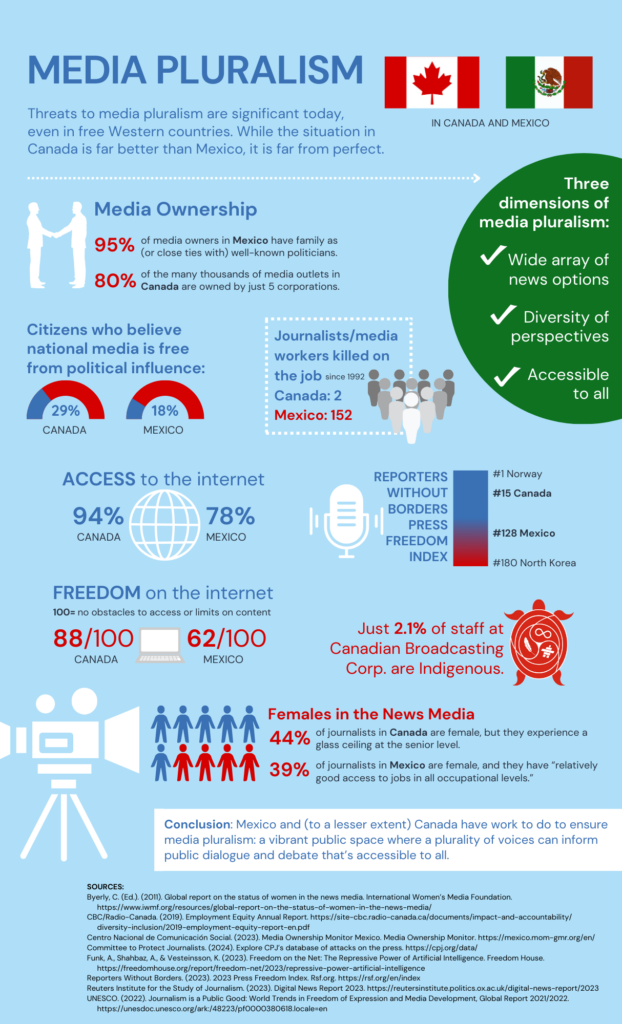
Without further ado, below is my attempt at capturing attention and improving comprehension with an infographic. It visually compares key aspects of media pluralism in Canada and Mexico. I thought I should learn about the differences in media freedoms to the North and South of me in my America-centric bubble. I created the infographic in Canva, and I found it quite easy to work on that platform.
Although I enjoy writing, if given the option, I’d choose to create a visual argument over a written one any day. I wish more of my grad school papers were infographic assignments. Fellow coms students, do you agree?